 Image via futureofmusic.org
Are MP3 downloads going the way of the CD already?
It's no mystery that the way we discover, buy, and listen to music changes seemingly every day; even your grandmother might have heard of Spotify at this point. The chart below, created by the RIAA and shared by Fast Company, demonstrates the channels of music consumption from 2003 to 2013. It might be hard to believe that in 10 short years the entire landscape of the music industry has changed, but for musicians, the appropriately shaped slope hints at what to expect in the next decade.
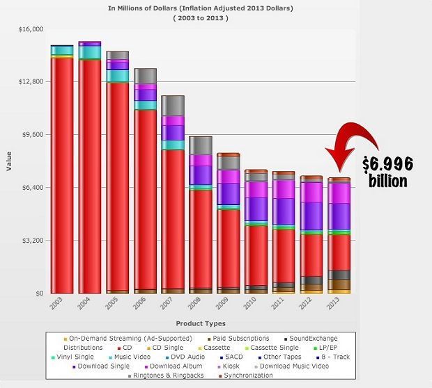 Image via riaa.com
Here's snippet from the Fast Company article to help make sense of what you're seeing in that graph:
"This chart... shows where the music industry's revenues come from now — the red represents CDs, dark purple is a downloaded single, light purple is a downloaded album, and the rest represent ad-supported streaming, paid subscriptions and internet and satellite radio. (Earlier in the 2000s, that little bit of turquoise represents music videos). Not only are physical music sales slipping, but iTunes downloads are as well — pretty quickly too. People are finding ways to listen to music that usually include the words Spotify or YouTube."
Did any of the chart's statistics surprise you? What do you think it might look like in another 10 years? Let us know in the comments!