Hence show off their color-coordinated outfits. (Photo by Kyrre Gjerstad)
Where would Pink Floyd be without their laser shows and inflatables? Gorillaz without their animated avatars? P-Funk without their spaceships and neon clothes? Or punk, metal, and hip-hop as a whole without their distinctive sets of visual iconographies inextricably tied to the music? Well, they’d still be great, but they'd definitely be missing something.
The first step to creating a visual identity is to stop thinking about it as a standalone marketing tool; it should intertwine with the music to create a coherent whole. Maintaining consistency becomes a lot easier when you keep that in mind. Easier yet is the question of what kind of visual identity you should establish for your band. Simple – it should reflect what your music sounds like and who your members are as people. In fact, many of the most effective band brands are simply visual metaphors for their sound or illustrations of their lyrics. For example, consider Tool's psychedelic imagery made to reflect the trippy themes and complex patterns in their music. Here are the key components to bear in mind as you begin to craft a memorable brand that's consistent across all platforms and marketing materials.
Color palettes
 Image via colorcombos.com
Ideally, you should lock in a color palette – the more specific, the better. Color charts and online services like Palleton and the Combo Library are all excellent places to start. Once you've picked out a set of colors that fits your style, make sure to write it down as specifically as possible. If you can narrow it down to the exact hex codes for the colors you want to use, perfect.
Don't worry too much about whether or not you'll want to stick with them forever; you can change the colors later or pick out another one for a different type of use. In fact, plenty of successful bands don't have a specific color scheme at all. This is alright, but I'd suggest at least picking a "mood" you want your image to have and tailor your color schemes to that.
Once you've picked a color palette, you should make sure to consistently apply it to as many of your materials as possible. This starts with your logo and website, then continues down to your flyers, business cards, and merchandise. As you can see in the featured image at the top of this post, you might also want to consider coordinating your clothes for band photos.
I'm reluctant to say that you should do your album packaging in your color palette, since so many musicians like each album to have its own unique image. This is good, but you might want to consider changing your entire color palette to match the album's for a while to help you maintain consistency. For example, when Green Day released American Idiot in 2004, the band's red, black, and white wardrobe on their subsequent tour matched the album's color scheme.
Iconography
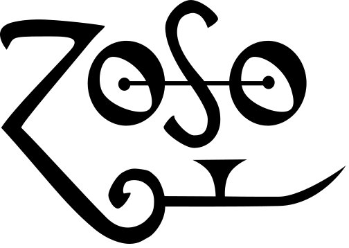 Led Zeppelin's "Zoso" symbol has become synonymous with the band's logo. (Image via Wikimedia Commons)
Your iconography starts with your logo, but doesn't end there. Think about the kinds of motifs you’d like to use across all your materials. For example, you might want your band to have a ‘60s theme or an animal motif. Generally, the principles of good iconography are the same across types: keep it simple, memorable, and relevant to your band's sound. In many cases, your logo might just be a unique font. But whether you choose to do it yourself or find a designer (hint: find a designer unless you are one), knowing what kind of iconography you're aiming for is always good.
There are plenty of ways to apply your iconography. For example, if you've decided you want to use a "grungy" motif for your band, you can use faded and scratchy graphics for your website, print your business cards and album booklets on rough paper, and use distressed-looking fonts for all your header and body copy. On that note...
Fonts
 Image via flickr.com
There are two basic types of text: header text, which is bold and decorative and designed to stand out, and body text, which is small, simple, and doesn't distract from the information it's conveying. (A thorough guide to it can be found here.) It should still be styled in a way that contributes to your image, however, and there should be something tying it to your header font. For example, you might decide you want all your fonts to be Old English, handwritten, or minimalist. If you establish a unifying theme and pick out one or two fonts you'd prefer to use for each of the three text types, you can keep your look consistent across your website, flyers, album booklets, and any other materials you happen to produce.
This will help establish a much stronger brand than if you use different fonts on every type of marketing material, or even worse, default to standard ones like Arial or Times New Roman. Your font choices should be applied as consistently as possible across all your marketing materials, but once again, you can make an exception for individual albums with unique identities.
Photos
 Photo by Louis Konstantinou
Band photos are an absolute necessity for your marketing materials. If possible, try to incorporate your color scheme into your photos, or at least the primary one that you use for your website and press kit. If you don't want to use the same color scheme in your photos, at least make sure you just have a dominant theme or mood.
The basics are simple: the photo should be a lineup of all your members. It should be clear, in focus, well-lit, well-composed, and high-resolution enough to use for most print purposes. No cell phone snapshots. Beyond that, the more creative you get, the better, as long as you don't sacrifice the basic purpose of showing what your band looks like. If you choose to experiment, however, you should take more than one and keep some others around as backups. If your primary photo isn't suited to a publication you want to get into, you can always send them one that's more their style.
The key to all of this is consistency, both in your goal and how you apply it. Remember, however, that you're not aiming for something set in stone. Just like your music, your image can (and should!) evolve while still being recognizably you.
C.S. Jones is a freelance writer, photographer, and artist. He frequently covers music, visual art, scenes, and culture in general. He's not that great of a musician, but he knows a lot about the music industry and really wants to help.