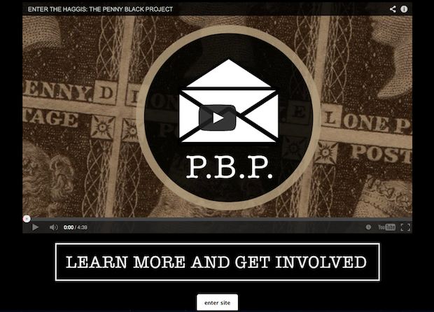
 An example of a proper intro page from the Enter the Haggis website.
This post originally appeared on the Bandzoogle blog. Dave Cool is the Director of Artist Relations for musician website & marketing platform Bandzoogle. Twitter: @Bandzoogle | @dave_cool
When used properly, intro or "splash" pages on your website can be an effective marketing tool for your music. However, they can easily be misused, which can hurt your site traffic, fan engagement and sales.
Here are four common mistakes we see with intro pages that you should avoid:
1. A permanent intro page
Intro pages should only be used for short periods of time and for specific calls-to-action. It becomes annoying for repeat visitors to keep having to click through to your main site. Also, Google picks up text content on your page, so if the first page of your website is an intro page, it's going to hurt your search ranking.
2. Too much content
Don’t clutter your intro page with music players, too many videos and various social feeds. Make it very clean and focused.
3. No clear purpose
There should be a clear purpose for the intro page. Let fans know about your new album, crowdfunding campaign, video, tour, etc. Don’t just have a photo of your band with an “enter site” link, as this simply wastes the visitor’s time with an extra click to get to your content.
4. A hidden “enter site” link
Make it very easy to find where to enter the full website from your intro page. If someone can’t quickly find out how to access your full site, they might just give up and go back to checking their Facebook and cat videos, and not come back.
So, what should you use an intro page for?
Ideally, you should use your intro page to focus on a specific call-to-action. A call-to-action is designed to direct people’s attention to something specific that you want them to do. This can be to:
- buy your new album
- contribute to your crowdfunding campaign
- watch your new video
- buy tickets for your upcoming tour
Again, the intro page should be temporary, and focused on a time-sensitive call-to-action. But if you want to be sure that your fans know about your new album/video/tour etc., intro pages can be an effective way to convey the message.
Other possible uses for intro pages
There are a few other ways to properly use intro pages, besides as a call-to-action:
- Under construction: Your website is still under construction, and you want your visitors to know that you’re still there even though your site isn't accessible. Even then, you can embed a video, or have a mailing list signup to engage the visitor in some way.
- Multiple websites: Many musicians wear several hats. If you have more than one website (one for your band, one for your solo act, and one for your sound engineer business), you can let visitors choose between these website options right away when they land on your page. Same if your website has sections in different languages.


