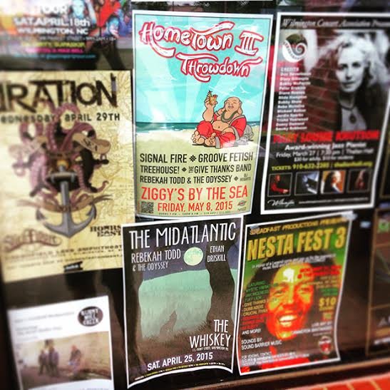
 Two of the author's posters hang in the window of a local music store in Wilmington, NC. (Photo courtesy of Tom Shaw)
One of the most important steps to getting people to your shows is a well-designed event poster. It's important to understand that most people won't spend more than a few seconds looking at your poster, so you need to be able to deliver all of the necessary information to them in a short amount of time. An impressive show poster can be the difference between someone coming to your show and not coming, or even knowing about your show at all.
An effective poster should always cover the following bases:
- The poster should have a professional look
- Important information should be legible from a distance
- Dates should be accurate and everything should be spelled correctly
Here are some useful tips on how to design an eye-catching poster that will stand out among the sea of flyers at your local coffee shop:
1. Simple is typically better
Your most important information (band names, date, and venue) should be legible from a distance, and your design should be intriguing enough to draw the passerby in to take a moment to read the smaller text. Try to avoid using any text that doesn't need to be there, but be sure to include anything that will entice people to come to your show. For example, avoid putting things like, "It's going to be a great show!" but definitely add "free show!" if applicable.
2. Use a contrasting text color, and make sure you're using legible fonts
It's very important to make sure there's a lot of contrast between the important elements of your event poster and everything else (i.e., if your poster is dark, use a white font, and vice-versa). Many bars/venues are very dimly lit, and while using colored fonts might look good on the computer, it probably won't stand out when your poster is hanging on the wall.
Try to limit yourself to no more than two fonts. A clean, easy-to-read font family that I commonly use is Myriad Pro. With about 20 different weights, you can get a lot of variation for different elements of the poster. I typically use a bold, narrow weight for the band names, date, and venue, and then a light, narrow weight for the ticket price, age restrictions, etc. Also, remember to pay attention to alignment, and be sure not to overcrowd your text.
3. Spell check! Date check! Double-check everything!
This should go without saying, but I can't tell you how many times I've seen typos on posters. Before you export your final file, make sure your month and date are correct. (Did you write "Friday" when your show is actually on Saturday night? July instead of June?)
Also, double-check that you spelled the band and venue names correctly, and that everything else is accurate with no important information left out! It'll help your band look more professional, get your fans out on the right night of the week, and keep other bands from hating you for spelling their name incorrectly.
4. If you're having trouble designing the poster yourself, then hire somebody
In order to create a professional-looking poster, it'll have to be made in a program like Adobe Illustrator, Photoshop, or something similar. By all means, avoid creating posters in Microsoft Paint.
The file will have to be created in CMYK format at 300 dpi in order to not look pixelated/blurry and accurate color-wise. If you don't have access to the proper programs to take care of this, hire somebody. You should be able to find a designer who can put a poster together for under $50, and the professional look of your new flyer could pay for itself by bringing more people out to your show! If you're having trouble finding a designer, you can always contact me.
A few quick bonus tips:
- Shop around your town for the cheapest print prices you can find. Also, keep in mind that color is great, but if you can come up with a solid design in black and white, you'll save yourself a lot of money!
- A QR code that links to a band video or Facebook event can help familiarize new fans with your band.
- If you're playing in a new market or there are bands on the bill that you don't think many people have heard of, it's always a good idea to put a two-to-three genre explanation of the music in small text under the band name (i.e., rock/blues/soul).
- Do your homework. Go where you might find event posters, stand about six feet back, and see which ones catch your attention and keep you reading. This will train your eye, and you'll have plenty of takeaways when it comes to creating your own event poster.
Get more gig poster advice:
- 5 Incredible Gig Posters to Inspire Your Own
- Top 5 Gig Poster Mistakes to Avoid
- Why Concert Posters Are Still Relevant in the Digital Age
- DIY Graphic Design Hacks for Bands on a Budget
Tom Shaw is a graphic designer living in Wilmington, North Carolina. He has designed event posters for national touring artists including Old Crow Medicine Show, JJ Grey and Mofro, Drive-By Truckers, Bela Fleck and The Flecktones, Dr. John, Warren Haynes, Galactic, and many others. He also plays guitar in the band Rebekah Todd and The Odyssey. If you would like Tom to create an event poster for your band, you can contact him here.


