If you're an indie musician, you probably do a lot of gigging. It's an incredible way to grow your fanbase, build a relationship with your fans, and make money. But between hiring a graphic designer and printing costs, you can really rack up the expenses just from making posters and flyers to promote your shows. You can actually design your own posters in the early stages of your career, so it doesn't have to cost an arm and a leg.
Canva is a free online graphics tool that's really easy to use, even for people who don't have a background in art or design. It has a large selection of stock photos, outlines, and graphic elements, but if you stick to the basics and use your own photos and art, it's 100 percent free. It's definitely not as robust as something like Photoshop, and you probably won't end up with something as good as if you hired a graphic designer, but if you're on a budget, it gets the job done.
To help you get started with creating your own gig posters in Canva, I'm going to walk you through it step by step. And just so you know, this article isn't sponsored by Canva in any way, nor am I affiliated with them. I just think it's a pretty cool tool and want to share it with indie artists!
Getting started
The first step is to sign up for Canva. You can choose to sign in with Facebook or create an account. After you register, you'll get a confirmation email and go straight to your design dashboard.
At the top, you can see a few of the many pre-sized design formats. They have everything from Facebook cover photos to album artwork, business cards to Instagram posts. For your gig flyer, let's go with either the US Letter, the Poster, or the Flyer format, depending on how big you want it.

The editor
Once you choose a format, you'll be taken right into the editor. In the "Search" tab, you can search through Canva's extensive library of photos and design elements. You can use this as a quick way to find what you're looking for.
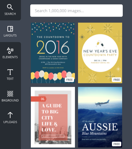
The "Layouts" tab has a bunch of pre-designed layouts that you can use as a starting point for your design. Keep in mind that a lot of these layouts will cost $1 to use, but there are a few free options. (You can always just use the $1 layouts for inspiration and create your own version.)
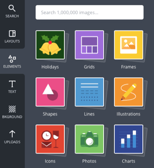
The "Elements" tab is where you'll find all the graphic elements like shapes, lines, charts, and icons. You can just drag and drop these elements into your design and then play around with the colors, size, and opacity.
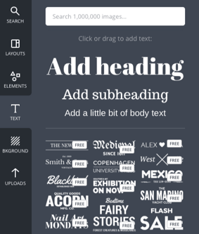
The "Text" tab is obviously where you'll add and edit your text. Just click to add in text or to add one of the pre-designed text elements.
And finally, the "Uploads" tab is where you'll add in your photos and art for the poster. Upload your album art and shots of you or the band to personalize the poster.
Creating your poster
This isn't a graphic design tutorial, but you should definitely follow some of these simple rules to keep your design looking professional. The aim here is to give you a better idea of how Canva works and how you can use it to DIY some of your graphic design needs.
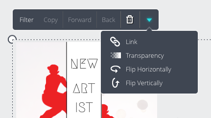
Let's start with the background. You can choose a solid color or an image, but keep in mind that your text needs to be legible, so don't do anything too busy. For this example, I've added in a photo and brought the transparency way down so it doesn't take away from the text. Just click the photo, choose the dropdown arrow, and click "transparency." You can also add filters to adjust the brightness, saturation, and colors.
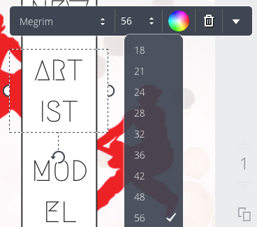
Next, let's tackle some of the text. When working with posters, simple is better, so choose one or two fonts and make sure the colors you choose contrast from your background. To add text, go to the "Text" tab and choose "Add Heading." Type your band or artist name in the text box and then edit your font, size, and color using the dropdown menus.
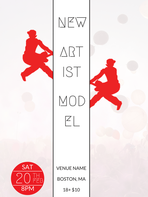
Next, we'll start adding in our design elements. In this example, I've added in two logos, cropped them, and placed them on either side of the name to create a mirrored effect. Again, you can make all these edits to images by clicking them and selecting from the dropdown menus.
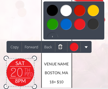
I also added a white rectangle to place behind the name so it really stands out, and placed two dark grey lines on either side to draw the eye to the name. I added the date and time information in a red circle that matches the logo color. All these can be found in the "Elements" tab.
Once you're finished, just click the "Download" button at the top of the screen. If you're printing, choose "PDF: for print." It will be a bigger file, but you'll have the highest resolution.
Here's the finished product. As you can see, you don't need to be a professional designer to create something that looks professional with Canva. Plus, the more you use it, the better you'll get at putting together creative designs!
Canva is also a great tool for designing your social media covers and header photos, as well as things like email banners, social media posts, and even artist business cards or download cards. If you'd like to learn more about promoting your music, check out this free email guide. You'll get 10 templates for the most common emails you'll have to send as an indie artist.
Dave Kusek is the founder of the New Artist Model, an online music business school for independent musicians, performers, recording artists, producers, managers, and songwriters. He is also the founder of Berklee Online, co-author of The Future of Music, and a member of the team who brought midi to the market.

