 Image via Shutterstock
As I've said time and time again on this blog, YouTube is probably one of the most important platforms available to you as an artist. You should spend a good chunk of your time thinking about what kinds of videos you want to post, making them all high quality and very watchable, and then also make sure that your descriptions and your bio are up to snuff.
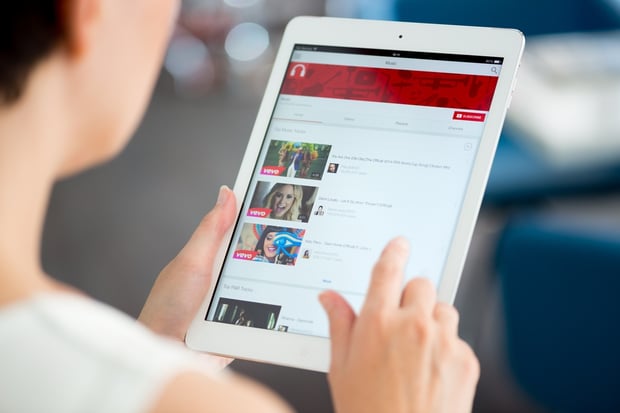
There's one other thing that should be on your mind as you navigate the world of YouTube content as well: your video thumbnails. The thumbnail is that tiny image you see when you're browsing the site, or on the sidebar when you’re watching something. Having one that stands out is one of the best ways for random people to discover you and your work on the site.
Now, this is a minuscule picture we’re talking about, so there is really only so much you can do with it, but there are a few best practices to keep in mind when you’re editing and uploading.
1. Be consistent
Even if all of your videos are different (which they should be), when someone is looking at a page of all your clips, the entire thing should all just... work. What do I mean by that? Well, imagine you’re seeing all these tiny images of many different videos. If they all have completely opposite looks to them, it’s a little confusing, and you don’t want to do anything that may turn people off.
When you start uploading videos to your YouTube page, pick a font, a color scheme, and a general look. Is it very simple and minimal? Is it very dark? Is it all based around one color? Animated? Instagram-looking photos? You should choose something that works for your band and your sound, but whatever that style is, stick with it.
2. Show your face
You want people to know you and become familiar with you, so don’t hide your face! This isn't always going to work, as some videos won’t have your face in them (think about ones with just your album cover and the music), but if it’s a proper music video, this is a good tip. Making you the focus of the thumbnail gives people a quick hint that they are about to watch a real clip, which people would usually rather spend their time on.
Don’t take a random photo and use that, but find a moment in the video where you are looking into the camera (ideally) and select that. Once people start looking into your eyes, they won’t be able to look away.
3. Make it obvious
Whatever you choose as the thumbnail for your video, it should be representative of what the clip actually is. Don’t always upload the same image, and don’t use a stock photo of your band if there's something better available! If it’s a tour diary, make your thumbnail a capture of you guys in the van, for example. If it’s a live clip, make the initial focus you on a stage under the lights and in front of the microphone. Without the help of words (which we’ll get to), people should almost always be able to tell what they're about to watch before they even click on it.
4. Use text
While your photo should be pretty clear and should let those browsing your videos know what each item contains, using text on some of your uploads is a good idea. You won’t need to write anything on the small image if it’s an especially striking sight – think a beautiful screenshot of your latest, wonderfully directed music video – but other than that, a little text isn’t terrible. If you’re doing a series of vlogs, you might want to say something like "Vlog #44." It’s simple, but when you only have a small bit of space and a brief second to get someone’s attention and convince them to click on your content, don’t let them scroll on by even the smallest bit confused.
5. Keep it bright
Whatever your color scheme, make sure it's visually appealing and that it stands out. By bright, I don’t necessarily mean that you need to have all of your thumbnail images filled in with neons and lighter shades, but whatever you do pick needs to be eye-catching. It might be a small bit of space on a computer screen, but everything can help, and a bright splash of color might just be enough to get somebody’s attention. Whatever you can do to make people choose your clip over something else, do it!
Next up:
- The Best Days and Times to Post New Videos on YouTube
- 5 Reasons Why People Aren't Watching Your YouTube Videos
- 25 Ways to Optimize Your YouTube Channel
- How to Stretch Out Your Song's Lifespan on YouTube
- 5 Smart Ways to Use YouTube as a Freelance Musician
Hugh McIntyre is a freelance pop music journalist in NYC by way of Boston. He has written for Billboard, The Hollywood Reporter, and MTV, as well as various magazines and blogs around the world. He is also the founder and editor-in-chief of the blog Pop! Bang! Boom! which is dedicated to the genre of pop in all of its glory.


