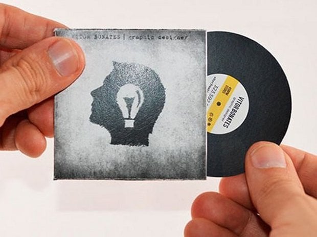
 This card by Vitor Bonates is a great example of creative and eye-catching yet sleek and simple design. (Photo via cardonizer.com)
As the industry increasingly relies on websites like SoundCloud, Bandcamp, and Facebook for discovering new artists, it might seem like business cards are an archaic form of making connections. If you're still passing out plain cards with a name and number, then sure, you're basically a dinosaur in the networking game. There are ways to update the medium, however, to ensure it's still a useful, worthwhile way of introducing yourself to new contacts. Check these tips before you send out for your next batch of business cards.
Basic setup
Don't use thin paper – use quality card stock. You should take care to avoid obvious cookie-cutter designs or images (please, no music notes), but that doesn't mean you can't select a provided template or layout. Just make sure it's not cheesy.
Info you should include
Make sure your business card contains the following:
- Your name
- Services provided
- Phone number
- SoundCloud, Bandcamp, Facebook, or YouTube pages
- A QR code for easy access (if you're feeling ambitious)
- Your website URL
Don't overwhelm people, though. It's not necessary to include every single social media account on your business card. Provide the ones you use most and that best exemplify your band.
Be creative...
Your card is a reflection of your artistry to an extent. If your design is too plain, you'll seem boring. Try creative touches like an interesting background, a photo of your band, or a different style of card altogether (such as a guitar pick).
It's not only in the design where you can have some fun, though. If humor is appropriate for your band, why not try a funny description of your services? If you're a tough rock 'n' roll act, say so. If you're a master MC, go with that. Don't settle for "professional guitar player." That could be anyone. Make the line about yourself totally you.
...But not over-the-top
While it's important that you express yourself with your card, don't get so carried away that the whole thing becomes illegible. Nutty fonts, a too-busy background, or absurdities in the name of humor can be off-putting instead of alluring and interesting. Have someone else look over your design before you print it and ask what he or she thinks. Is it too cluttered? Does it represent your band well? Is it too much? Pick someone who will be honest with you, then compare his or her opinion against your own.
Stay tuned for a second installment that will feature in-depth help with designing and printing your own business cards.
Jhoni Jackson is an Atlanta-bred music journalist currently based in San Juan, Puerto Rico, where she juggles owning a venue called Club 77, freelance writing and, of course, going to the beach as often as possible.


